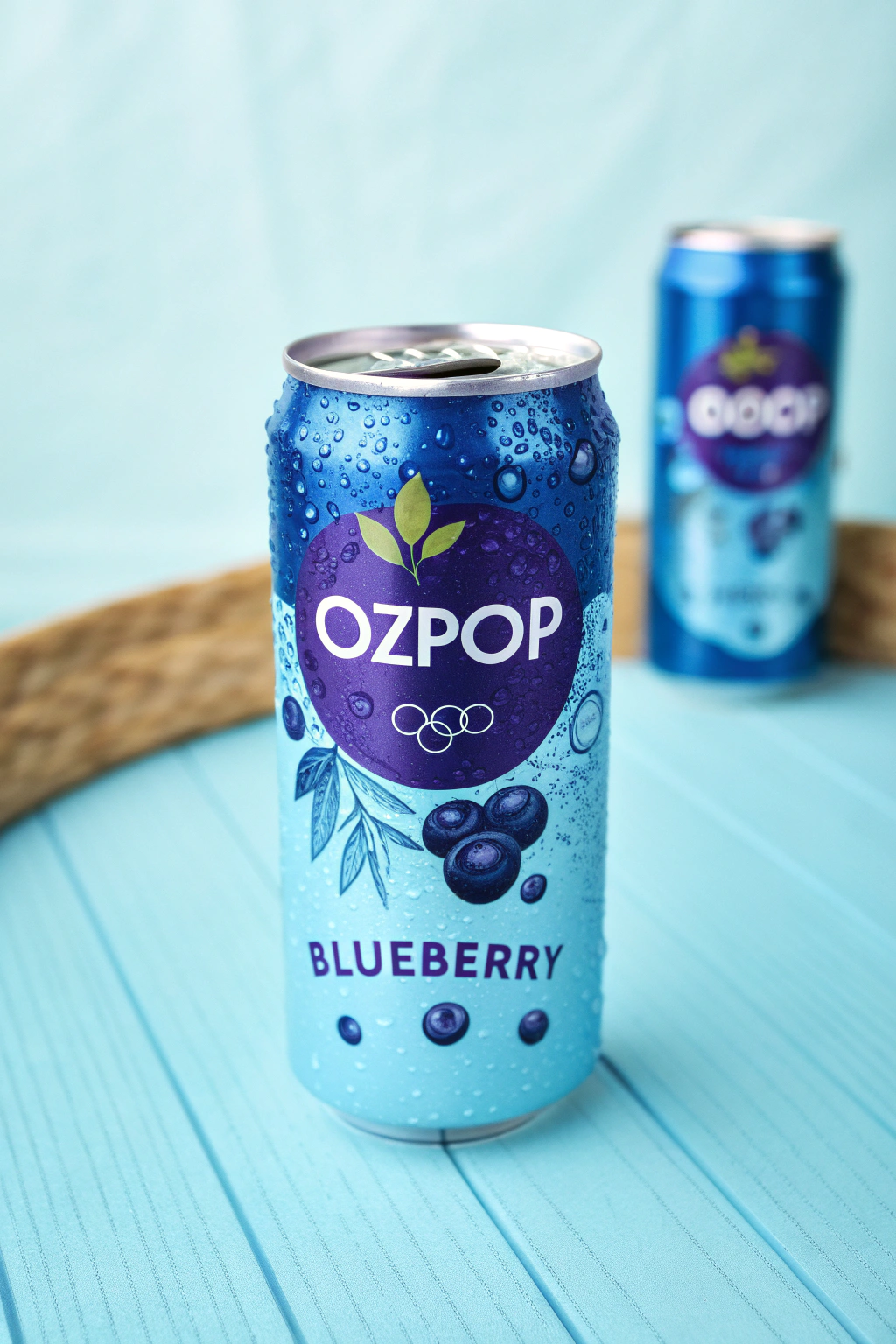
An energy drink company mainly focussing on selling their drinks in a soda can. The branding and packgaing design mainly focussed on attracting age groups between 12-30.
The goal was to create colorful, funky and innovative packaging deisgn for every flavour.
Branding
Packaging
Ozpop Soda
March 2024
An analysis on what colors catches the eyes of the customer at a supermarket. Color research on which flavors required fruit colors and contrasting colors.
A thorough market research showed us what kind of designs caught the attention of different age group. The goal was to convey the flavour just by looking at the color of the can or image in the can.
Eye-catching design and funky colors to bring out the zing of the flavours in the design.
.png)
.png)
.png)
.png)